I worked in security operation centers for a long time, and I really grew to hate dashboards. Most of them were specially designed pages by vendors meant to impress folks who don’t know any better when they stroll through the SOC and glance at the wall of low-end plasmas. They didn’t really help me catch bad guys any better, and worse yet, my bosses made my ensure they were always functional. Fast forward a few years, and I end up working for a vendor who builds security products. Much to my dismay, while planning for features we end up having to build these same dashboards because, despite my best efforts to persuade otherwise, CISO’s consistently ask for eye candy, even while admitting that it doesn’t have anything to do with the goal of the product. Some of them even tell us, straight up, that they won’t purchase our product if it doesn’t have eye catching visuals.
I provide that backstory to provide some insight into my long, tortuous relationship with useless dashboards. I talk about this enough at work that I feel like I’ve almost created a support group for people who have stress triggers associated with dashboards. If you’ve ever attended a conference talk from my good friend Martin Holste, you may know he hates dashboards even more than me. Alas, I’m not here just to rant. I actually believe that dashboards can be useful if they focus less on looking like video games and they help analysts do their job better. So, in this post I’m going to talk about three dashboard metrics you can collect right now that are actually useful. They won’t look pretty, but they will be effective.
Data Availability
The foundation of any investigation is rooted in asking questions, making hypotheses, and seeking answers that either disprove or prove your educated guesses. Your questioning and answer seeking with both be driven, in part, based on the data you have available. If you have PCAP data then you know you can seek answers about the context within network communication, and if you have Sysmon configured on your Windows infrastructure, you know you can look for file hashes in process execution logs.
While the existence of a data source is half the battle, the other half is retention. Some sources might have a specific time window. You might store PCAP for 3 day and flow data for 90 days, for example. Other data sources will probably use a rolling window, like most logs on Windows endpoints that are given a disk quota and roll over when that quota is met. In both cases, the ability to quickly ascertain the availability of data you have to work with is critical for an analyst. In short, if the data isn’t there, you don’t want to waste time trying to look for it. I contend that any time spent gathering data is wasted time, because the analyst should spend most of their time in the question and answer process or drawing conclusions based on data they’ve already retrieved.
A data availability section on a live dashboard helps optimize this part of the analyst workflow by providing a list of every data source and the earliest available data.
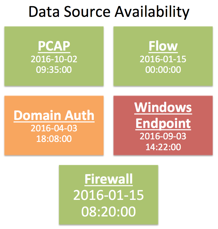
In the example above I’ve created a series of tiles representing five different data types common to a lot of SOCs. Each tile boldly displays the name of the data source, and the earliest available date and time of data for it. In this example, I’ve also chosen to color code certain tiles. Data sources with a fixed retention period are green, sources with a rolling retention period based on a disk quota are yellow and red. I’ve chosen to highlight endpoint logs in red because those are not centralized and are more susceptible to a security event causing the logs to roll faster. The idea here is to relay some form of urgency into the analyst if they need to gather data from a particular source. While PCAP, flow, and firewall logs are likely to be there a few hours later, things can happen that will purge domain auth and Windows endpoint logs.
Ideally, this dashboard component is updated quickly and in an automated fashion. At minimum, someone updating this manually once a day will still save a lot of time for the individual analyst or collective group.
Open Case Status
Most SOCs use some form of case tracking or management system. While there aren’t a lot of really great options that are designed with the SOC in mind, there are things people find a way to make work like RTIR, Remedy, Archer, JIRA, and more. If integrated properly, the case management system can be a powerful tool for facilitating workflow when you assign users to cases and track states properly. This can be a tremendous tool for helping analysts organized, either through self organization or peer accountability.
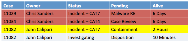
In this example, I’ve gone with a simple table displaying the open cases. They are sorted and color coded by alive time, which is the time since the case was opened. As you might expect, things that have been pending for quite some time are given the more severe color as they require action. This could, of course, be built around an SLAs or internal guidelines you use for required response and closure times.
The important thing here is that this dashboard component shows the information the analysts needs to know. This provides the ability to determine what is open (case number), who they can talk to about it (owner), how serious it is (status), what it’s waiting on (pending), and how long have we known about the issue (alive).
Unsolved Mysteries
On any given day an analyst will run into things that appear to be suspicious, but for which there is no evidence to confirm that suspicion. These unsolved mysteries are usually tied to a weird external IP address or domain name, or perhaps an internal user or system. In a single analyst SOC this is easily manageable because if that analyst runs across the suspicious thing again it is likely to draw attention. That is a tougher proposition in the larger SOC however, because there is a chance that a completely different analyst is the one who runs across the suspicious entity the second time. In truth, you could have half a dozen analysts who encounter the same suspicious thing in different contexts without any of them knowing about the other persons finding. Each encounter could hold a clue that will unravel the mystery of what’s going on, but without the right way to facilitate that knowledge transfers something could be missed.
As a dashboard component, using watch lists to spread awareness of suspicious entities is an effective strategy. To use it, analysts must have a mechanism for adding things to a watch list, which is displayed on a screen for reference. Any time an analyst runs across something that looks suspicious but they can’t quite pin down, they first check the screen and if it’s not on there, they add it. Everything that shows up on this list is auto cycled off of it every 24-48 hours unless someone else puts it back on there.
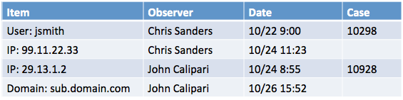
In this component, I’ve once again chosen a simple table. This provides the thing that is weird (item), who to talk to about it (observer), when it was observed in the data (date), and where you can go to find out the context of the scenario in which it was found (case) if there is any.
Conclusion
A Dashboard doesn’t have to use a fancy chart type or have lasers to be useful. In this post I described three types of information that are useful in a SOC when displayed on a shared dashboard. The goal is to use group dashboards to help analysts save time or be more efficient in their investigations. If you have the capacity to display this information, you’ll be well on your way to doing both of those things.
—
Do you have a really useful dashboard idea that you think is relevant in most SOCs? Let me know and I might blog about it down the road in a follow up.
Interested in learning more about the investigation process and how these dashboards fit in? Sign up for my mailing list to get first shot at my upcoming course focused entirely on the human aspect of security investigations.
Great article Chris, I never miss any of the article you post on here. I have so much respect for you because you take time out to write this stuff. It helps me massively. so Thank you very much.
Kal
Nice Article. Any recommendations on how to get the data source availability dashboards to auto update as the retention changes?